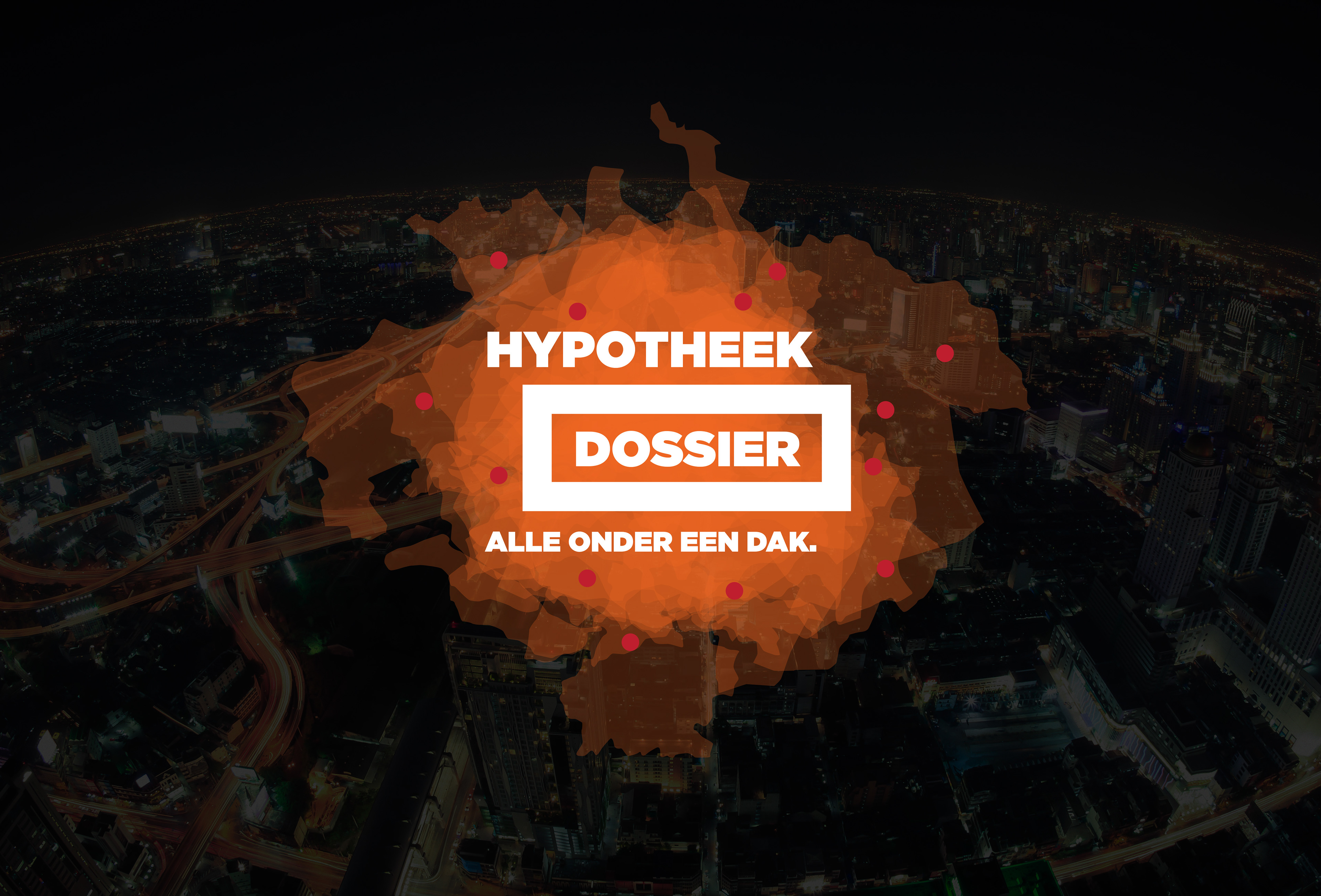
Hypotheek Dossier must be one of the more friendlier brands to come market during the past years. You just upload you income etc etc and Hypotheek Dossier does the negotiations with neccesary banks etc to give you the most beneficial house/apartment mortgage offer available.
The logotype we proposed.
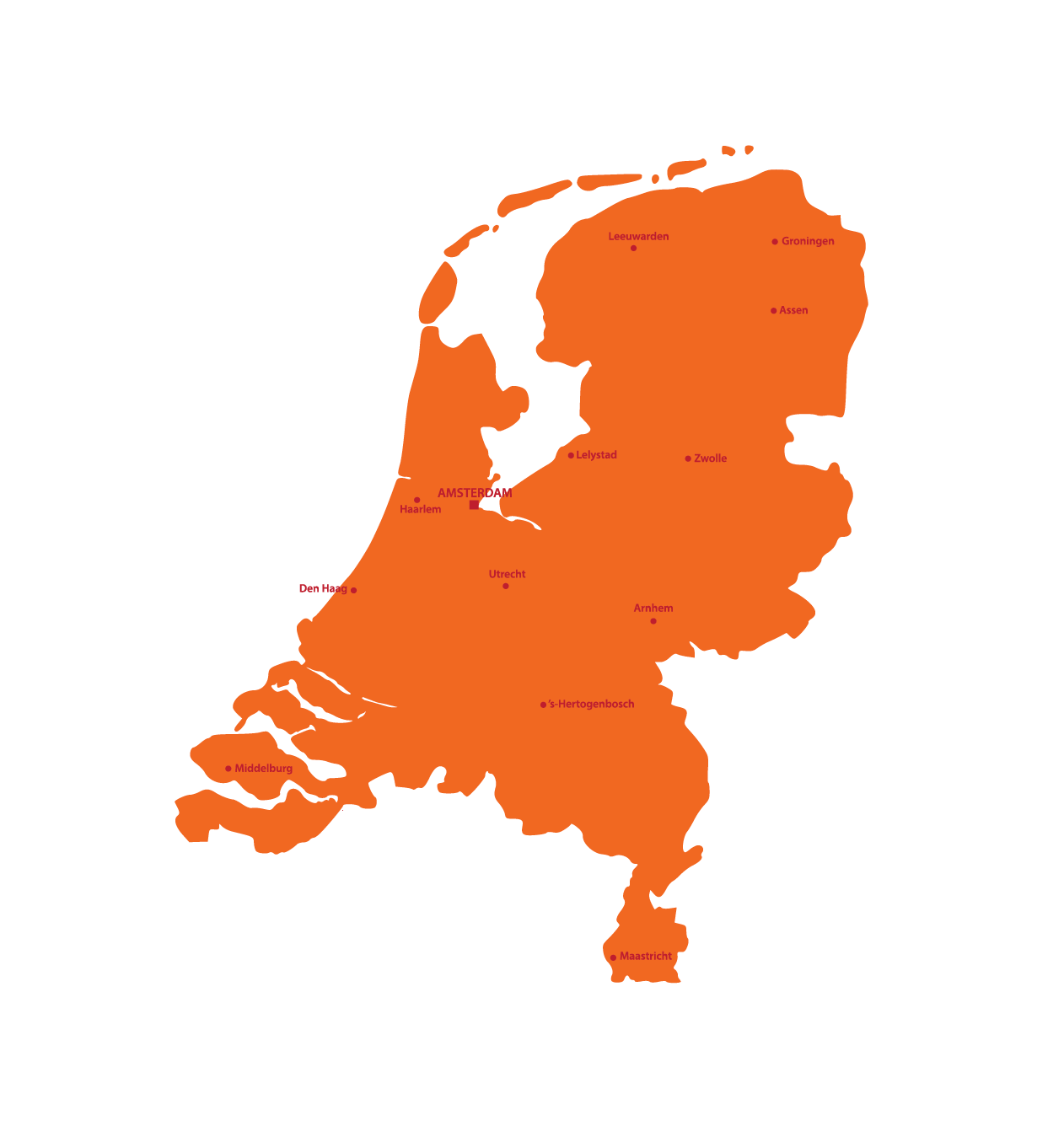
Since the initial, and main, market is the Netherlands we simply took a map over Netherlands, Divided it into the different regions and the largest cities and created a mash up of the result into the logotype.
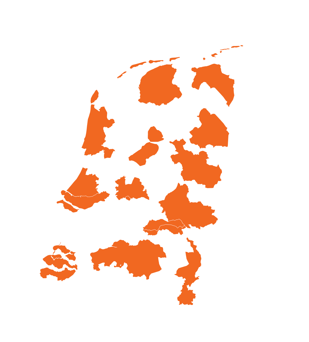
Divide and conquer.
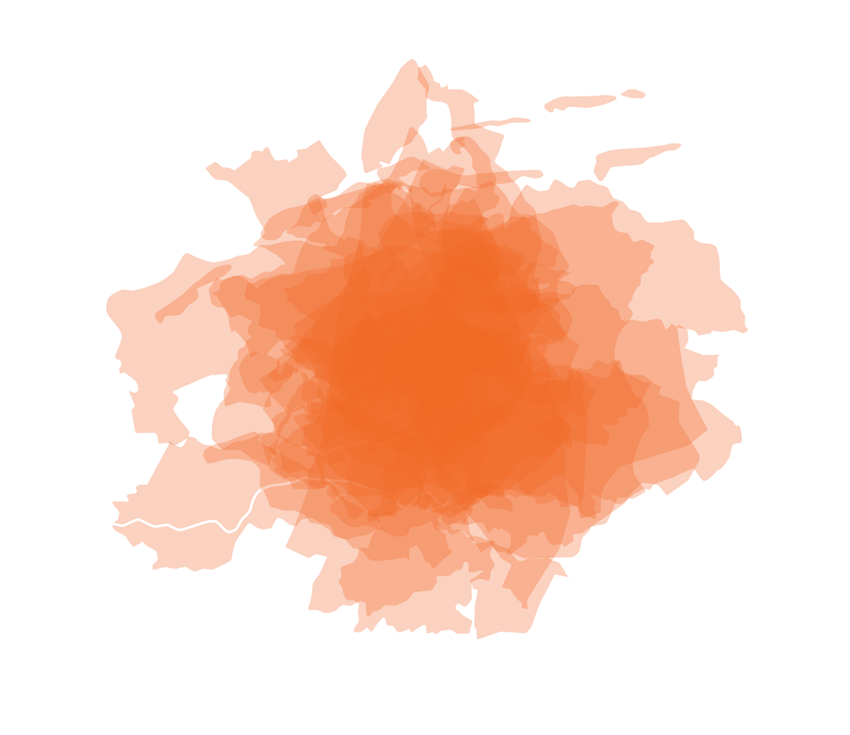
Center align.
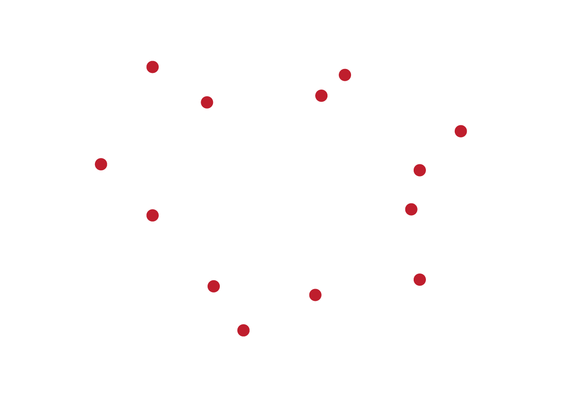
Add the thirteen largest cities of Netherlands.
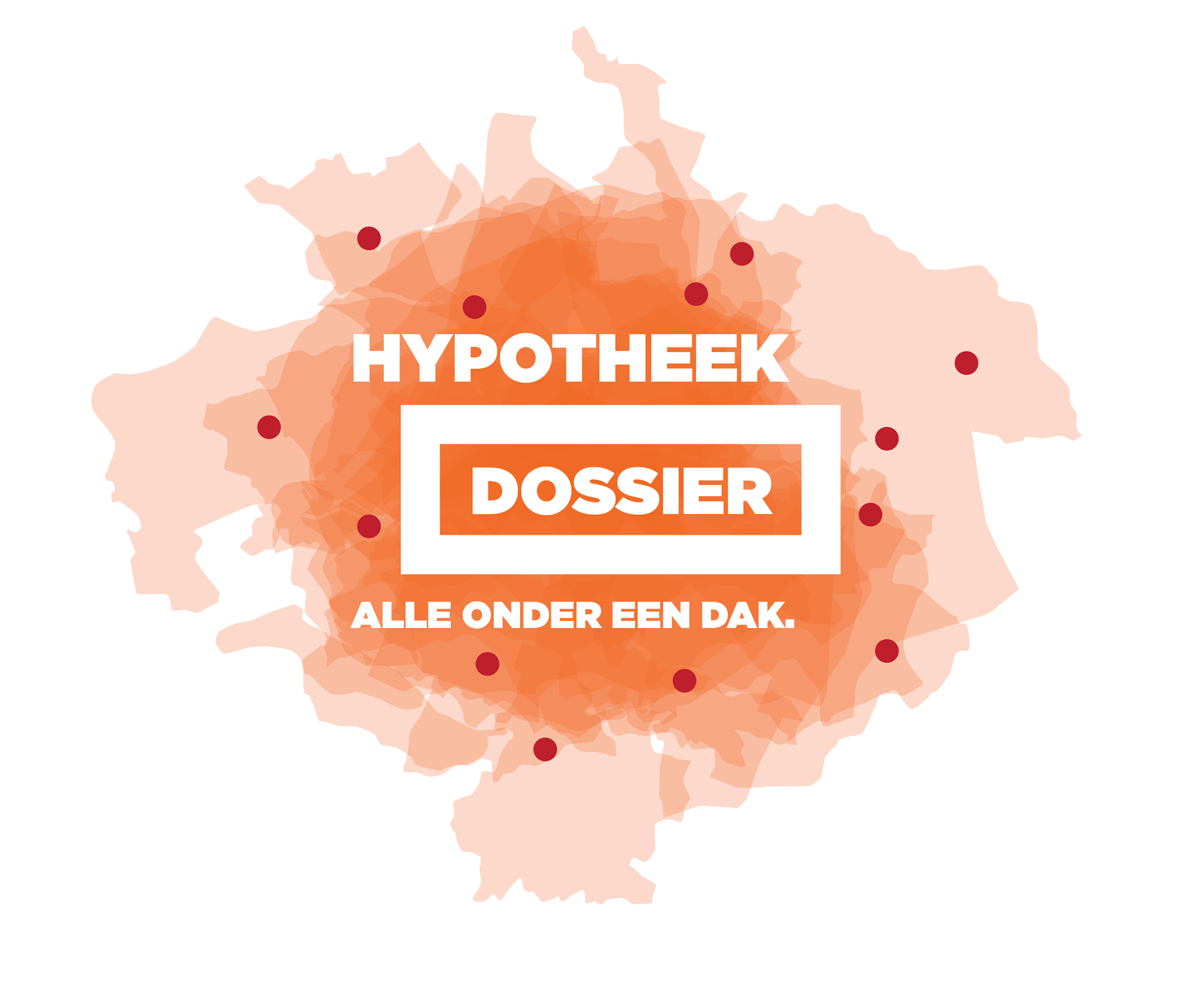
And add the graphic logotype.
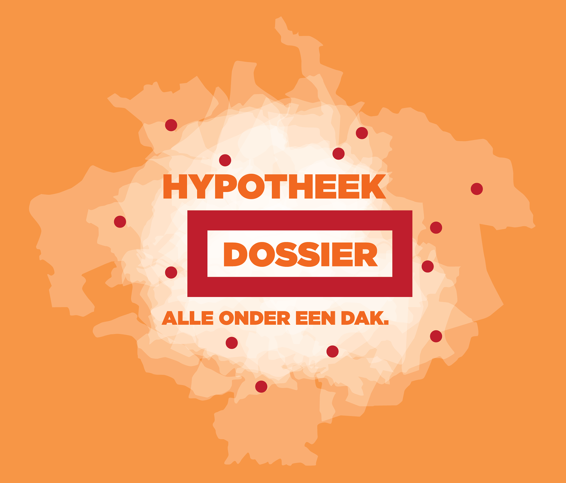
And go ALL orange on that mutherf**ker! :)
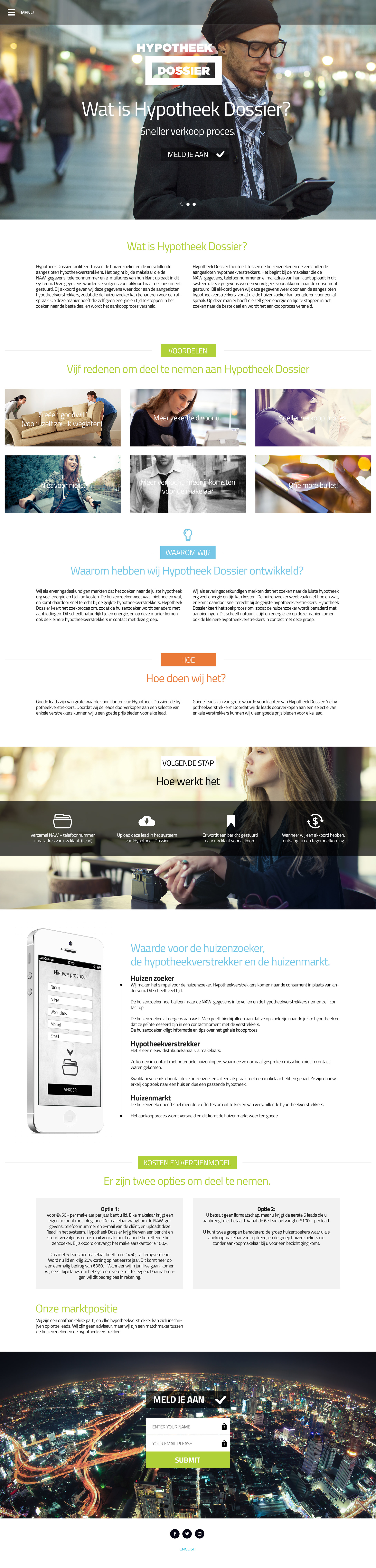
One page web site design. As in trendy. Cool roll-overs and animation to spice the surf up.
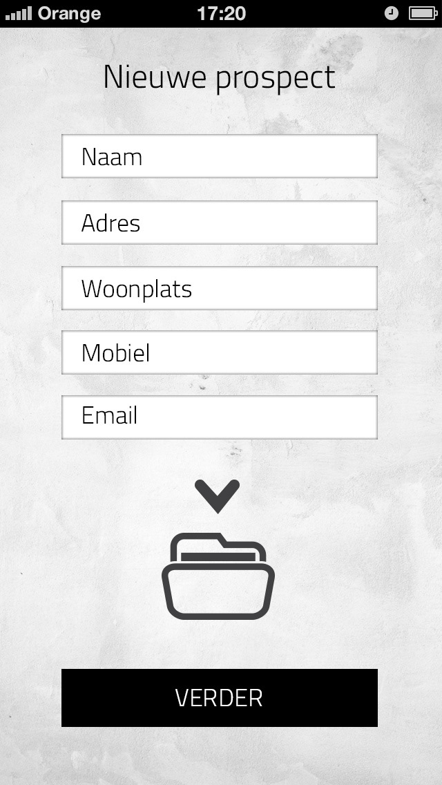
The marketing was built upon that the real estate broker collected leads. So we developed a smart phone application that in the most simplest of ways let the real estate agent sumbit the details for the lead we brought to our database.